How to Design a Clothing Brand Logo That Actually Works. Detailed Guide
Designing a logo for your clothing brand? Here’s a step-by-step breakdown of how you can create a clothing brand logo that looks legit, feels right, and works across every platform and product.
Step 1: Know Your Brand Like You Know Your Favorite Hoodie
Before you even open a design tool, get clear on what your brand is and what it stands for. This clarity will shape every design choice you make.
Ask yourself:
Are we streetwear or high fashion? Vintage or techwear?
Who is our target group? — Gen Z trendsetters, eco-conscious minimalists, or sneakerhead dads?
What’s the vibe? Raw and rebellious, or sleek and understated?

Pro move: Pull together a moodboard with logos, colors, textures, and fonts that feel on-brand. Pinterest, Dribbble, and even your own wardrobe are great places to start.
Step 2: Look at the Competition. But Don’t Copy
Study other fashion logos — not to imitate, but to understand what works. Take notes on:
- Typography styles: Serif = premium. Sans-serif = modern. Handwritten = playful or indie.
- Color choices: Black and white is classic. Earth tones are usually for sustainable brands. High-contrast colors are used for bold streetwear.
- Icon use: Is the logo just text, or does it include a mark?

Luxury brands often use serif fonts and gold accents.

What makes it unique: Iconic serif logo and monogram, paired with brown and gold tones.
Why it works: Instantly signals luxury, heritage, and exclusivity.
Core vibe: Elegant, timeless, high-end.
Streetwear brands lean toward bold, edgy typography.

What makes it unique: The iconic “Swoosh” paired with a simple custom typeface.
Why it works: Instantly recognizable, dynamic, and universally versatile.
Core vibe: Energy, confidence, motion.
Eco-friendly brands favor earthy tones and organic shapes.

What makes it unique: Rugged serif logo with earthy green and brown tones.
Why it works: Reflects nature and the brand’s strong eco values.
Core vibe: Organic, grounded, sustainable.
Notice trends — then break them. That’s how you stand out.
Step 3: Time to sketch. Brainstorm Ideas That Stick
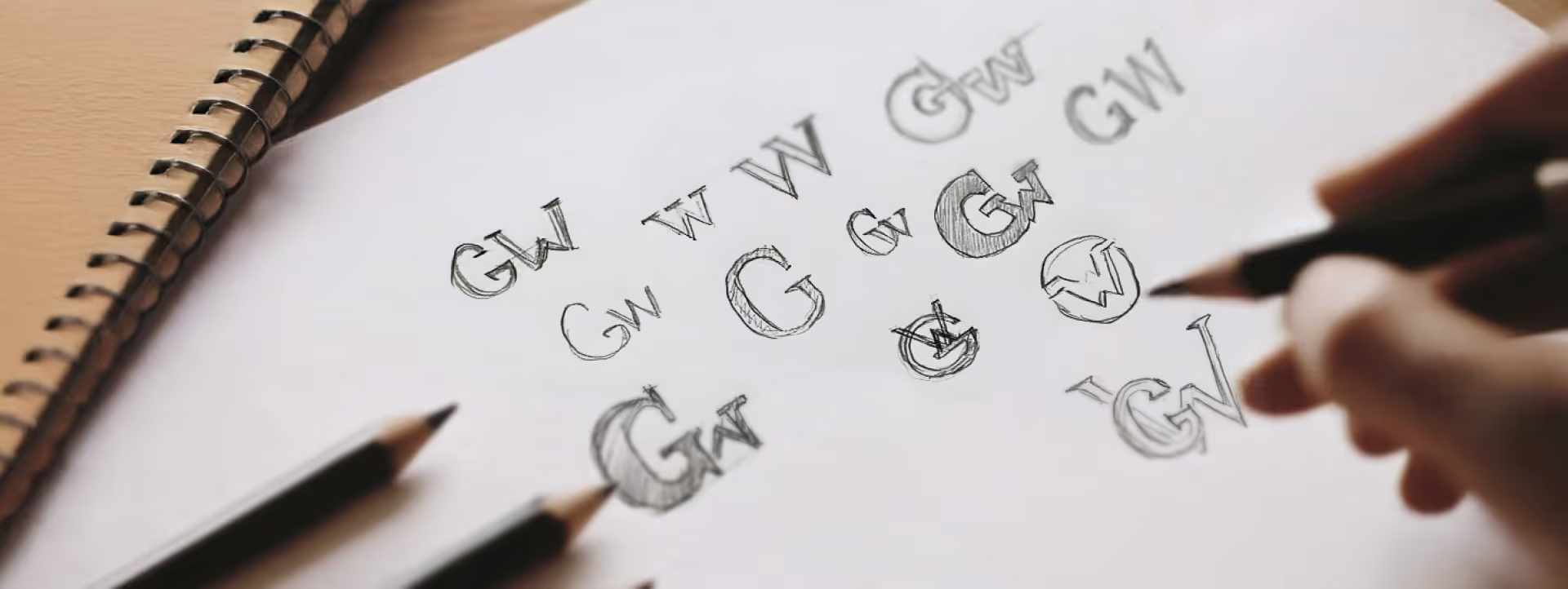
Once you’ve soaked up enough inspiration, it’s time to sketch. Yes, even if you “can’t draw.”
Start with:
- Initials or monograms (great for minimal branding)
- Symbols that reflect your values (e.g., flame for energy, needle for craftsmanship, leaf for sustainability)
- Custom lettering or modified fonts
Don’t aim for perfection — aim for options. You’ll refine later.
Step 4: Nail the Typography and Color Scheme
Your typeface and palette tell people what kind of brand you are — instantly.
Fonts:
Luxury labels often go for sharp serifs (think Burberry).
Streetwear brands lean into bold, all-caps sans-serif fonts (like Supreme or Stüssy).
Indie or sustainable brands might use hand-drawn or softer fonts.

Colors:
Black & white = versatile, always chic
Earth tones = natural and grounded
Neons or brights = youthful and energetic
Pick no more than 2–3 brand colors, and make sure they work in both full-color and monochrome versions.

Step 5: Choose the Right Tools for the Job
You don’t need fancy software to get started, but a few tools will make life easier:
For Beginners:
Canva – drag-and-drop simple
Looka or Hatchful – logo generators to test ideas
For Pros:
Figma – flexible and collaborative
Adobe Illustrator – best for creating crisp, scalable vector designs
Cinema 4D / Blender – want a 3D logo that pops? This is the move.
Sketch first. Then take it into digital form.
"Color is a power which directly influences the soul."
– Wassily Kandinsky, artist and color theorist.
Step 6: See How It Looks in the Wild
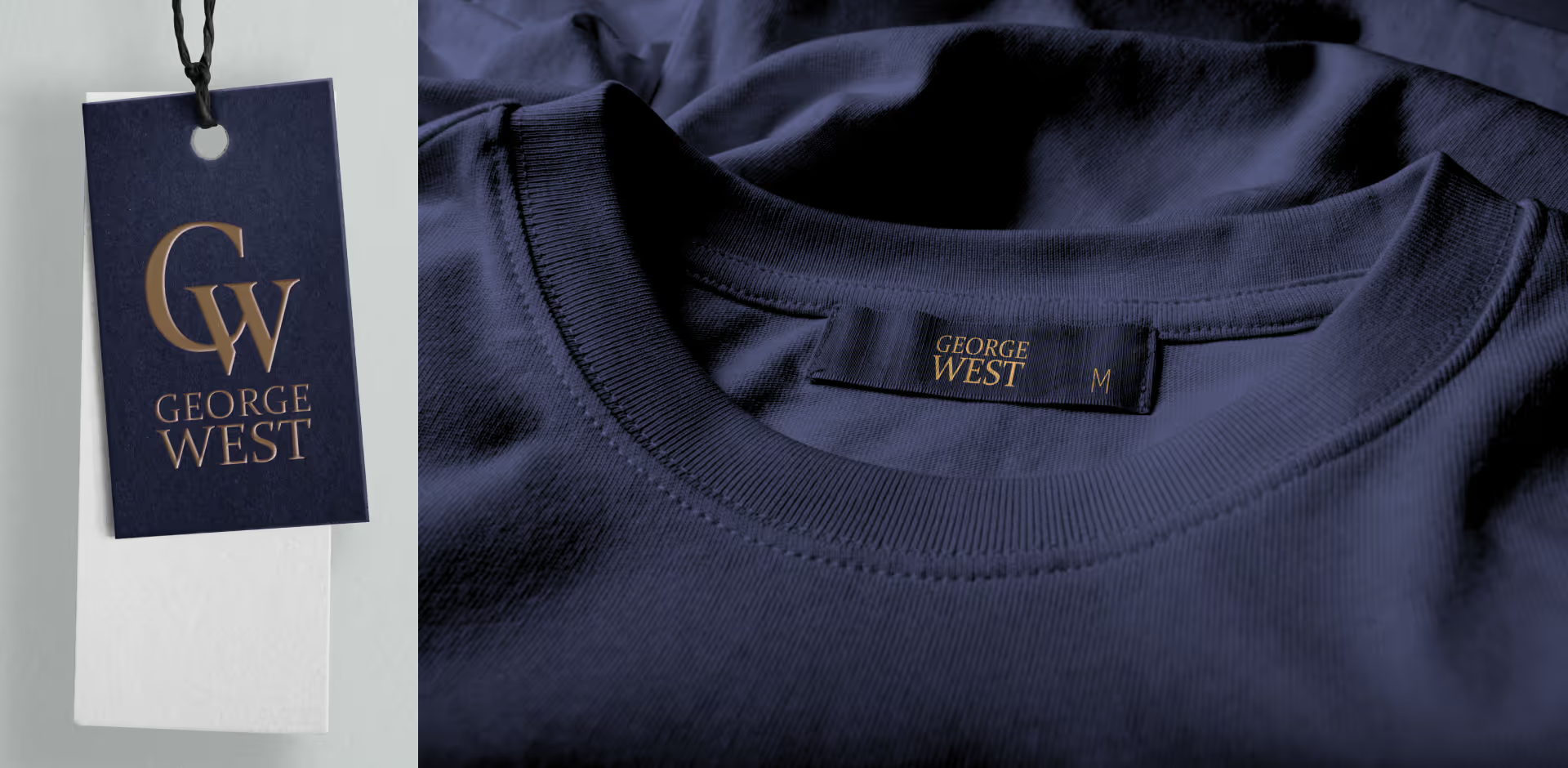
Your logo has to look good everywhere — from the inside label of a t-shirt to a TikTok thumbnail.
Here’s how to test it:
Use mockups (t-shirts, hoodies, hats, hang tags), try showing them on a billboard:
Scalability
Ensure your logo looks great at all sizes, whether it’s on a tiny label or a large billboard.

Platform-Specific Testing
Test how your logo appears on websites, YouTube thumbnails, and Instagram profiles. Check readability at small sizes

Mockups
Use mockups to visualize your design on clothing, tags, and digital screens.
Flip it to black/white — does it still hold up?
Hot tip: Don’t rely on visual effects (like gradients or shadows). A good logo works in its simplest form.
"Good design is a lot like clear thinking made visual."
– Edward Tufte, data visualization expert.
Final Thoughts
Designing a clothing brand logo is about clarity, creativity, and feeling. Whether it ends up embroidered, screen-printed, or stamped on packaging, your logo needs to hold its own — bold or minimal, timeless or trendy.
Start small, stay consistent, and don’t overthink it. The best logos don’t scream. They belong.
Want the Full Logo Design Process?
If you’re looking for a more complete walkthrough — including how to gather feedback, export files in the right formats, and protect your logo legally — check out our full logo design process. It covers everything from moodboarding to trademarking.
FAQ
What are the 7 types of logos?
The seven types of logos are:
- Wordmark: Text-only logos (e.g., Google).
- Lettermark: Initial-based logos (e.g., HBO).
- Pictorial Mark: Symbol or icon (e.g., Apple).
- Abstract Mark: Unique, abstract design (e.g., Nike swoosh).
- Combination Mark: Text and symbol together (e.g., Adidas).
- Emblem: Text inside a symbol or shape (e.g., Starbucks).
- Mascot: Illustrated character representing the brand (e.g., KFC).
What is the golden rule for logos?
The golden rule for logos is simplicity. A simple logo is easier to recognize, memorable, and versatile for various applications, from small clothing tags to large digital banners. Avoid clutter and focus on clean, impactful design elements.
How many Colours should a brand logo have?
A brand logo should ideally have 1 to 3 colors. This ensures simplicity and versatility while keeping it visually appealing. Use color psychology to pick hues that reflect your brand’s personality (e.g., green for eco-friendliness, black for luxury).
How to choose a logo style?
Choose a logo style based on your brand’s values, target audience, and industry trends. For example:
- Minimalist logos suit modern and luxury brands.
- Playful logos work for casual or youth-oriented brands.
- 3D logos add depth and a modern edge.
Consider your brand’s message and where the logo will be used, such as clothing tags, websites, or social media.


