
Responsive Design: Figma Breakpoints → Webflow/Framer Workflow
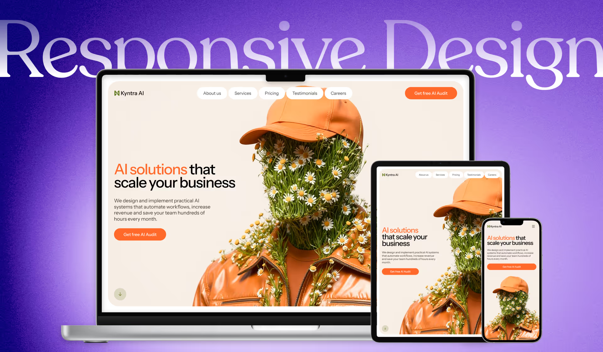
Responsive design is often treated like “shrink the layout until it fits.” In practice, it’s about designing a tailored experience for the device someone is using.
Responsive design allows us to give users a specific and custom experience based on the device they’re using.
This workflow focuses on designing responsiveness in Figma first, so your Webflow or Framer build is faster, cleaner, and less guessy.
What responsive design actually means (before we touch Webflow/Framer)
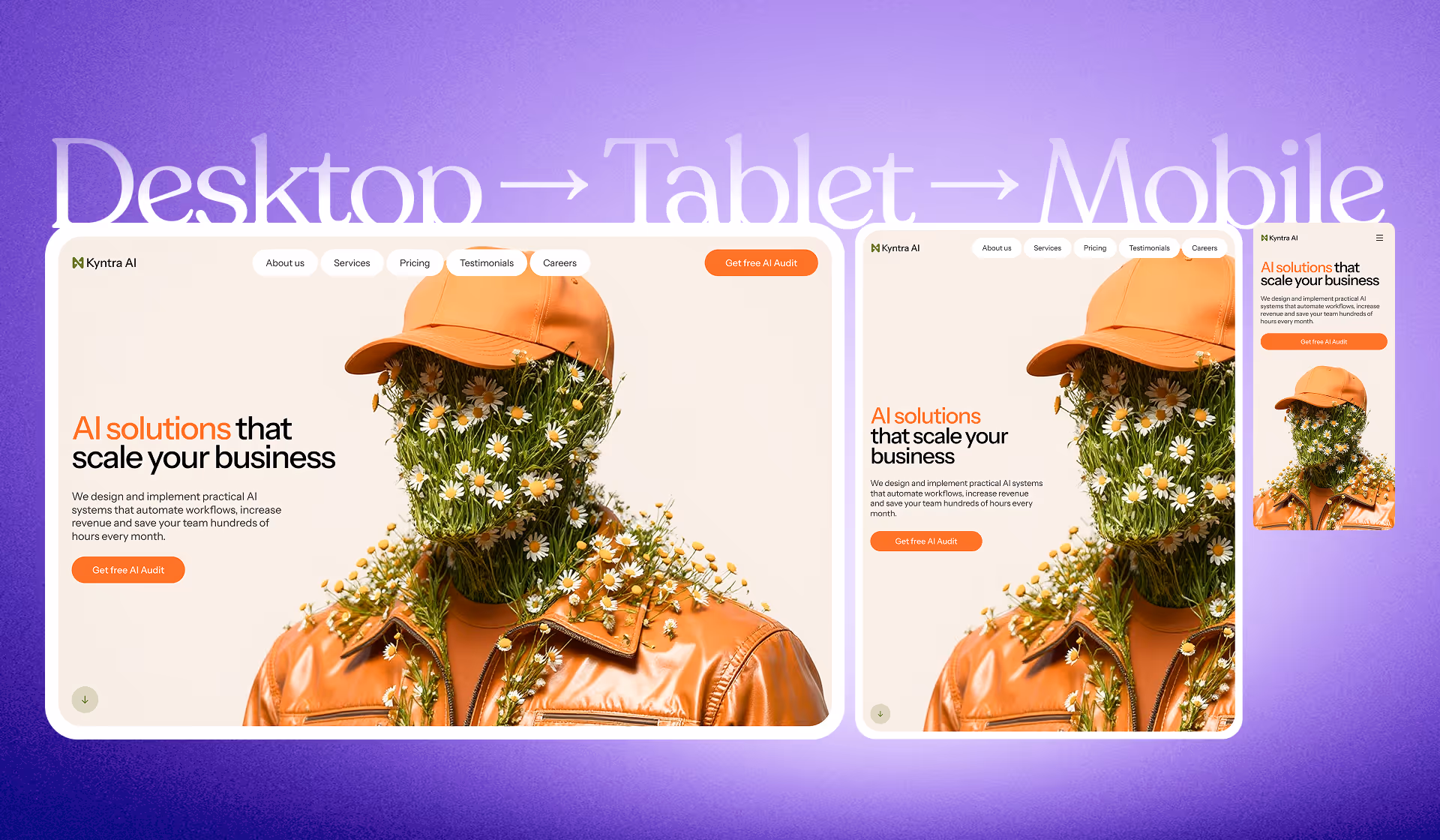
Responsive design means the desktop experience is not the same as tablet, and tablet is not the same as mobile. Sometimes the layout changes. Sometimes the information changes.
Every experience should be suited towards the device the user is using… sometimes we have to change the information or the layout.
Think in pixel ranges, not “one breakpoint”
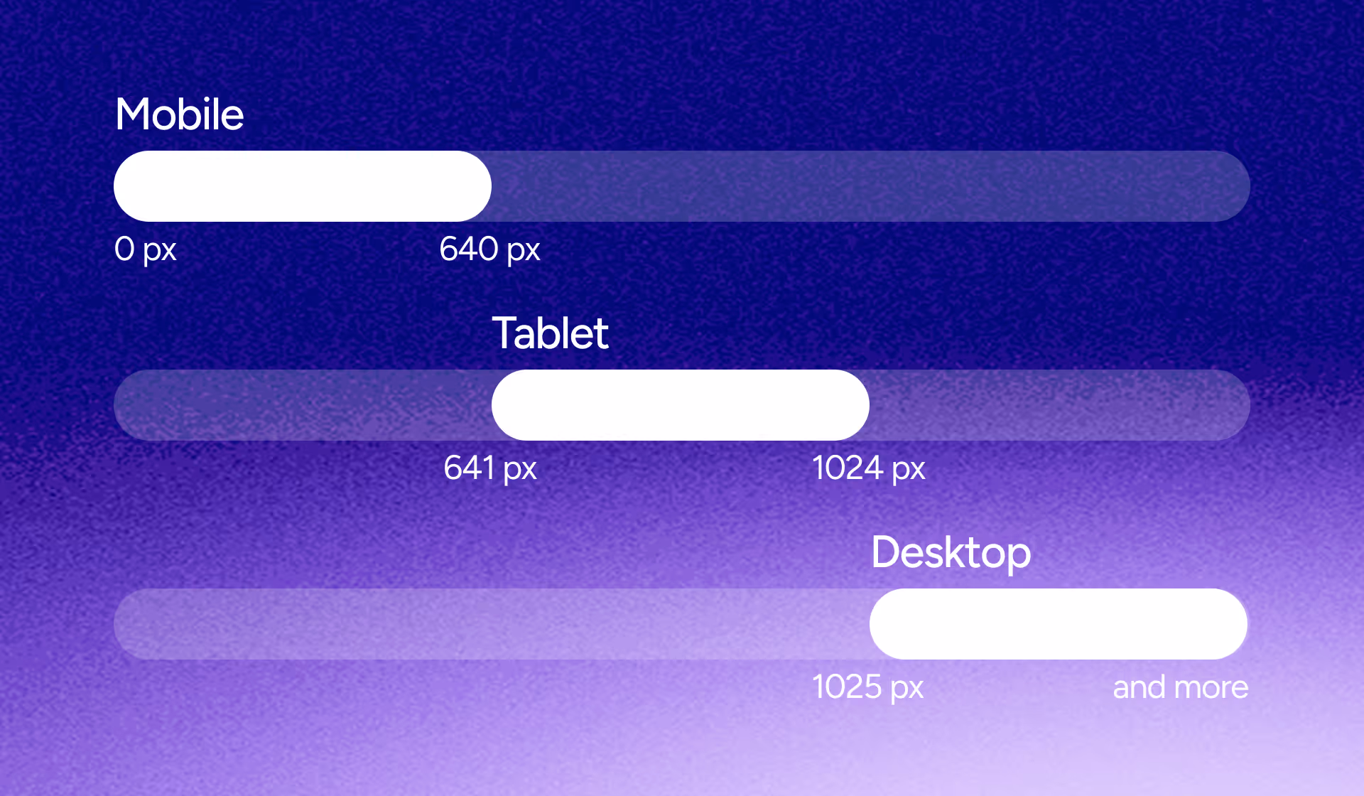
One mental shift makes responsive design click: treat breakpoints as ranges, not a single pixel value.
Example ranges from the script:
- 0–640px: one mobile layout/look
- 641–1024px: one tablet layout/look
- 1025px and up: one desktop layout/look
There’s no single “correct” set of breakpoints. The ranges you choose depend on your project - and even large sites use different breakpoints across different pages.
There is no one right pixel value… it’s going to be depending on your project.
The 3-step Figma workflow that makes Webflow/Framer builds easier
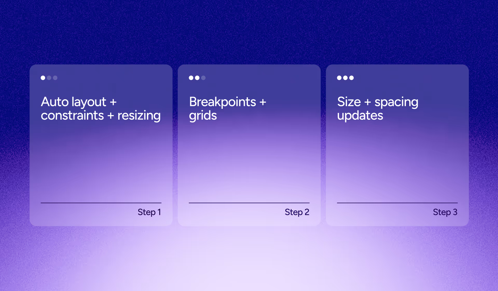
This workflow is built around three steps:
- Set up Auto Layout, constraints, and resizing
- Define breakpoints and grids
- Update type sizes and spacing for tablet and mobile
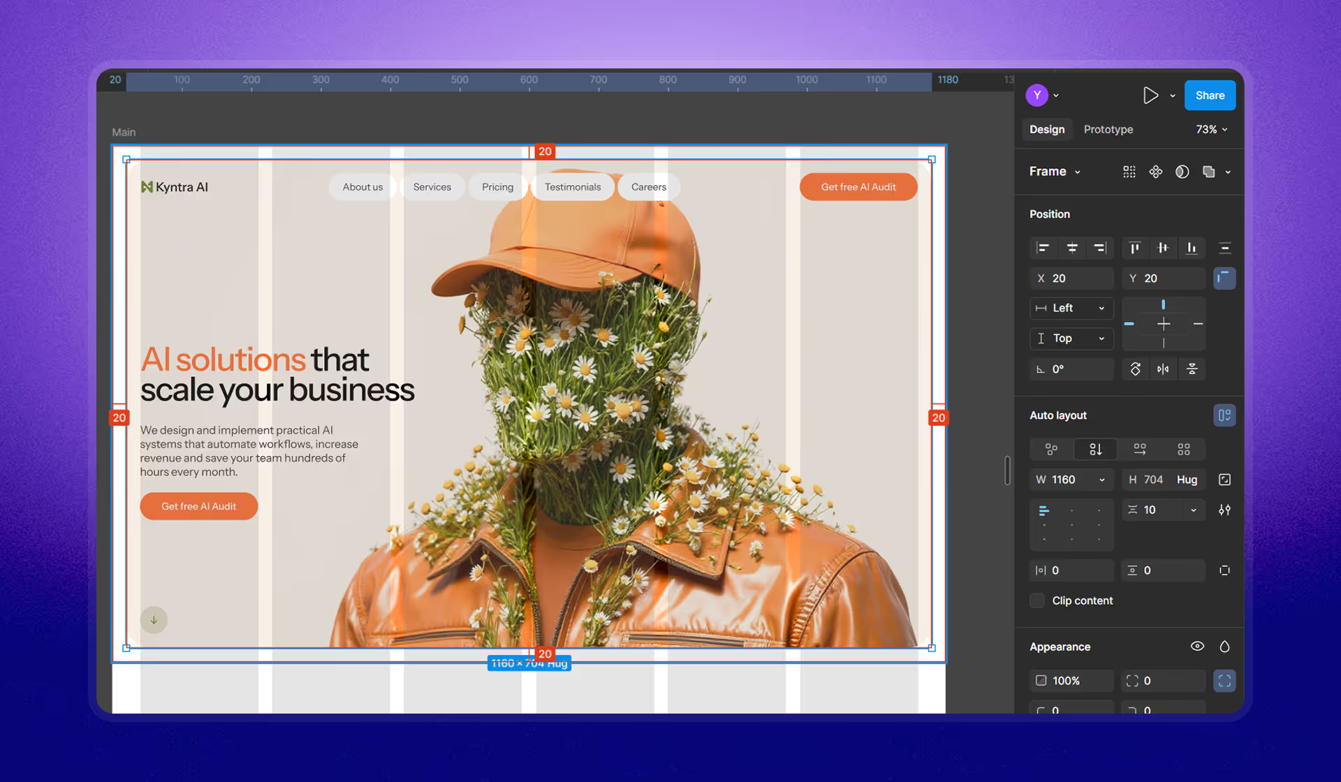
Step 1: Set up Auto Layout + constraints + resizing (make the desktop frame truly responsive)
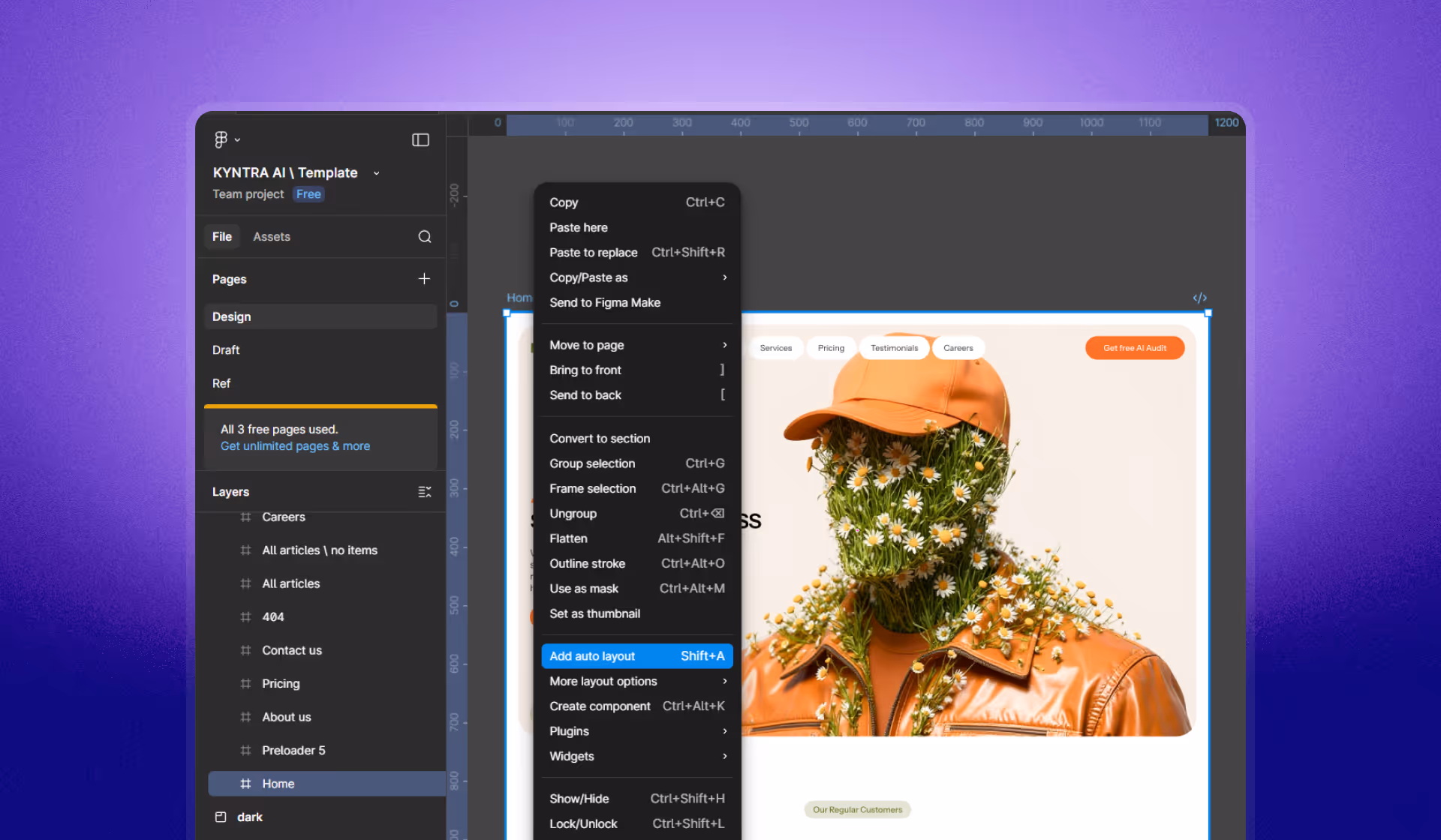
Start from a desktop layout, but don’t leave it as a fixed, rigid frame. Convert the layout into Auto Layout, then go container by container.
Group elements into containers first
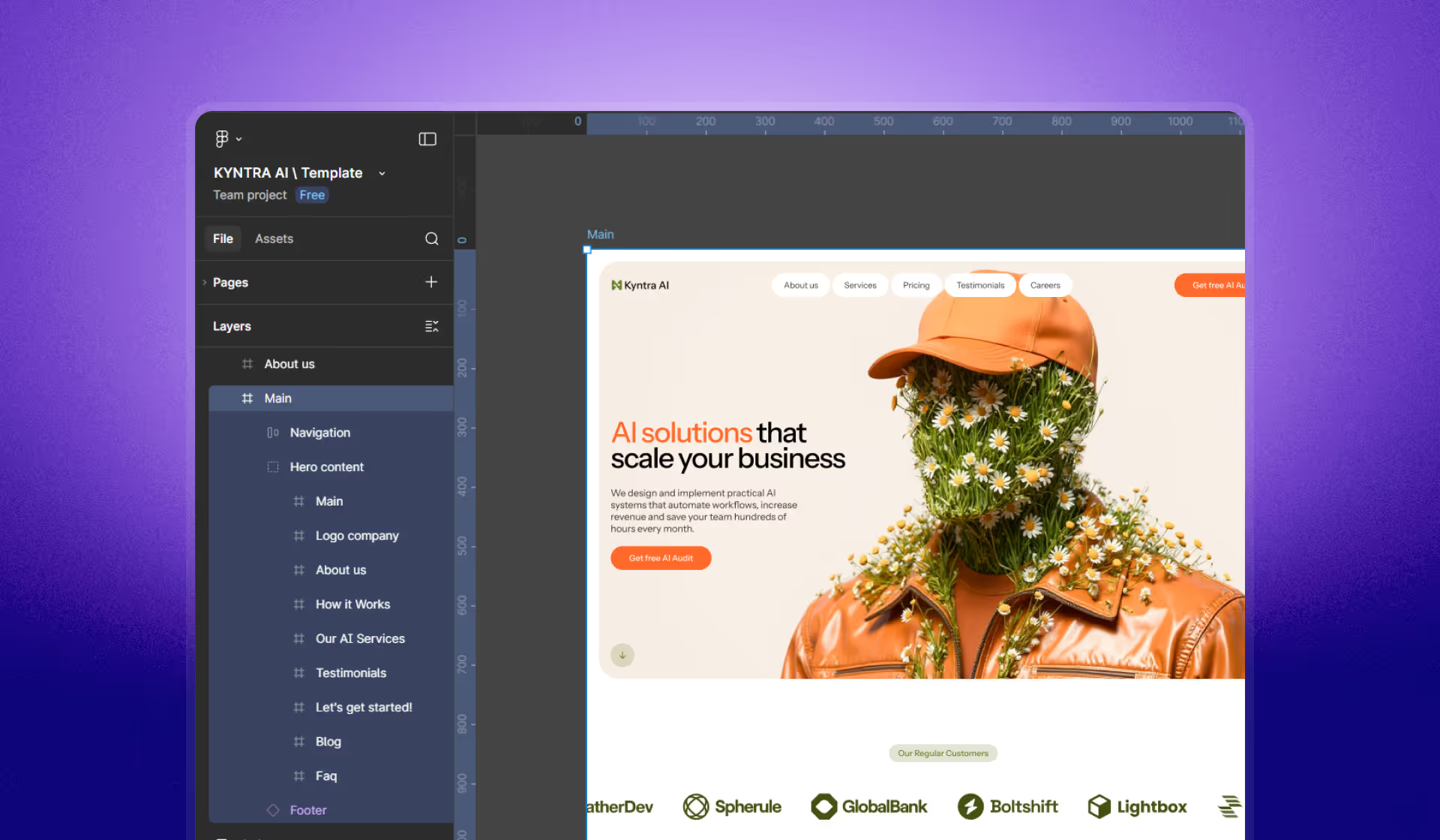
Group elements logically: links and buttons, logo and nav items, text blocks, and hero image + hero text as a single hero content container.
Auto Layout alone doesn’t make it responsive - constraints do
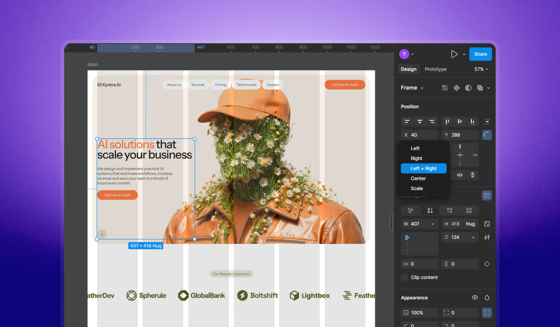
After Auto Layout, the next critical piece is constraints. For navigation, switch spacing from a fixed value to “Space between,” then set constraints from Left to Left & Right.
We need constraints… change from left to left and right.
Fix “Fixed/Hug” sizing by switching to “Fill container”
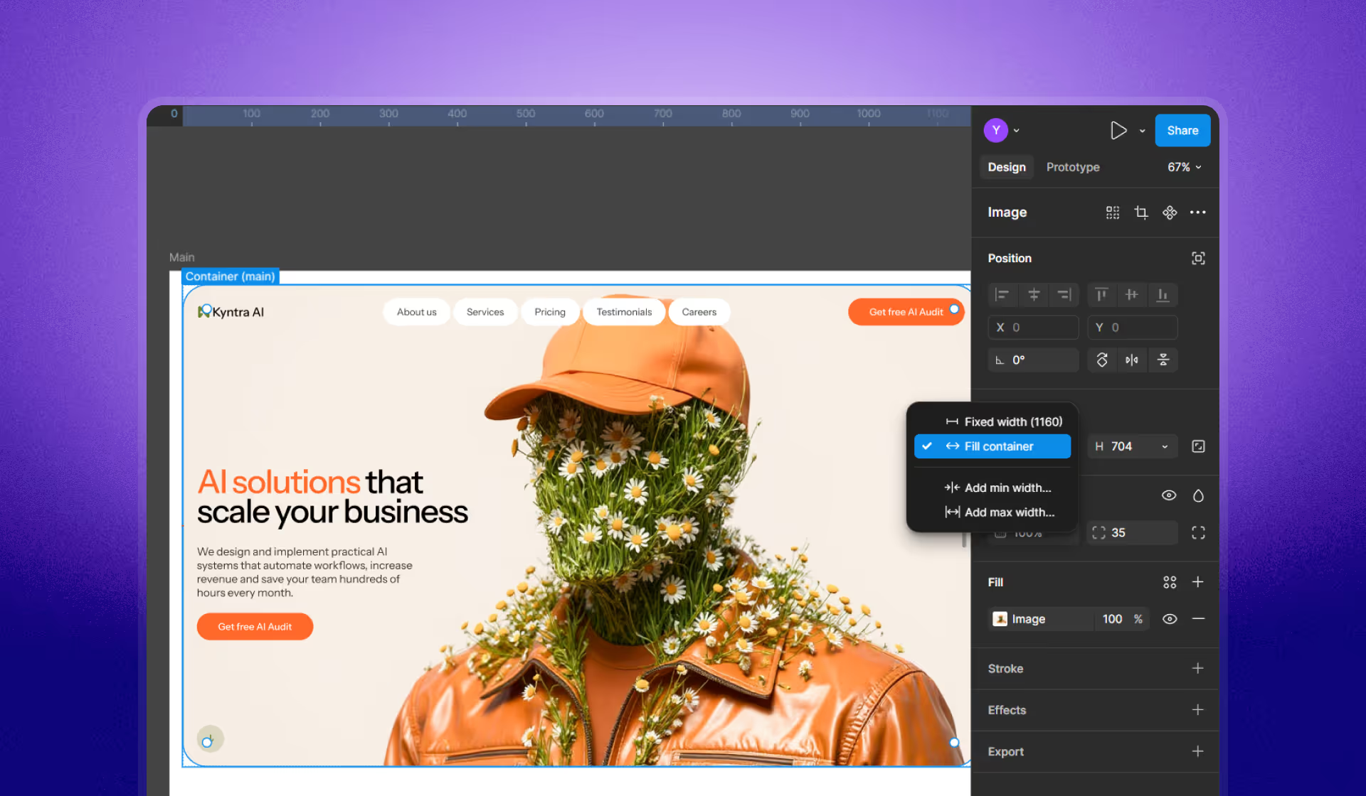
A common reason constraints don’t work: elements inside Auto Layout containers are still set to Fixed width or Hug. Change text and images to Fill container where appropriate.
We need the things to be set to fill container.
Once text and images are set to Fill container, the layout starts behaving like a responsive system (including equal column distribution).
These two take up the same amount of space… that’s what fill container does.
Final piece: set the container itself to Left & Right
Even after Fill container is correct, set the parent container’s constraints to Left & Right so it holds both edges and resizes predictably.
We need it to hold on to each edge… change it to left and right.
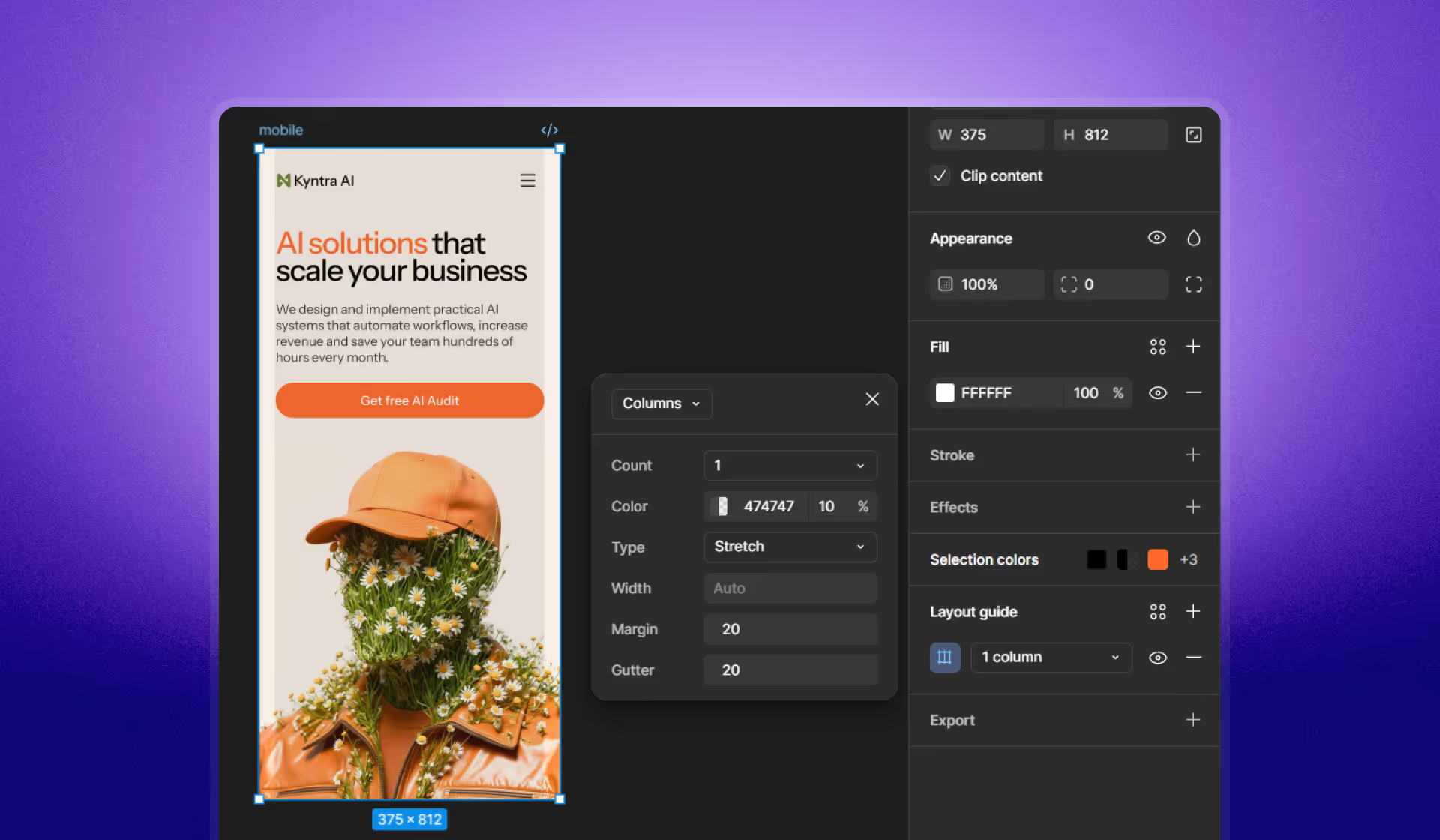
Step 2: Define breakpoints + add grids (desktop → tablet → mobile)
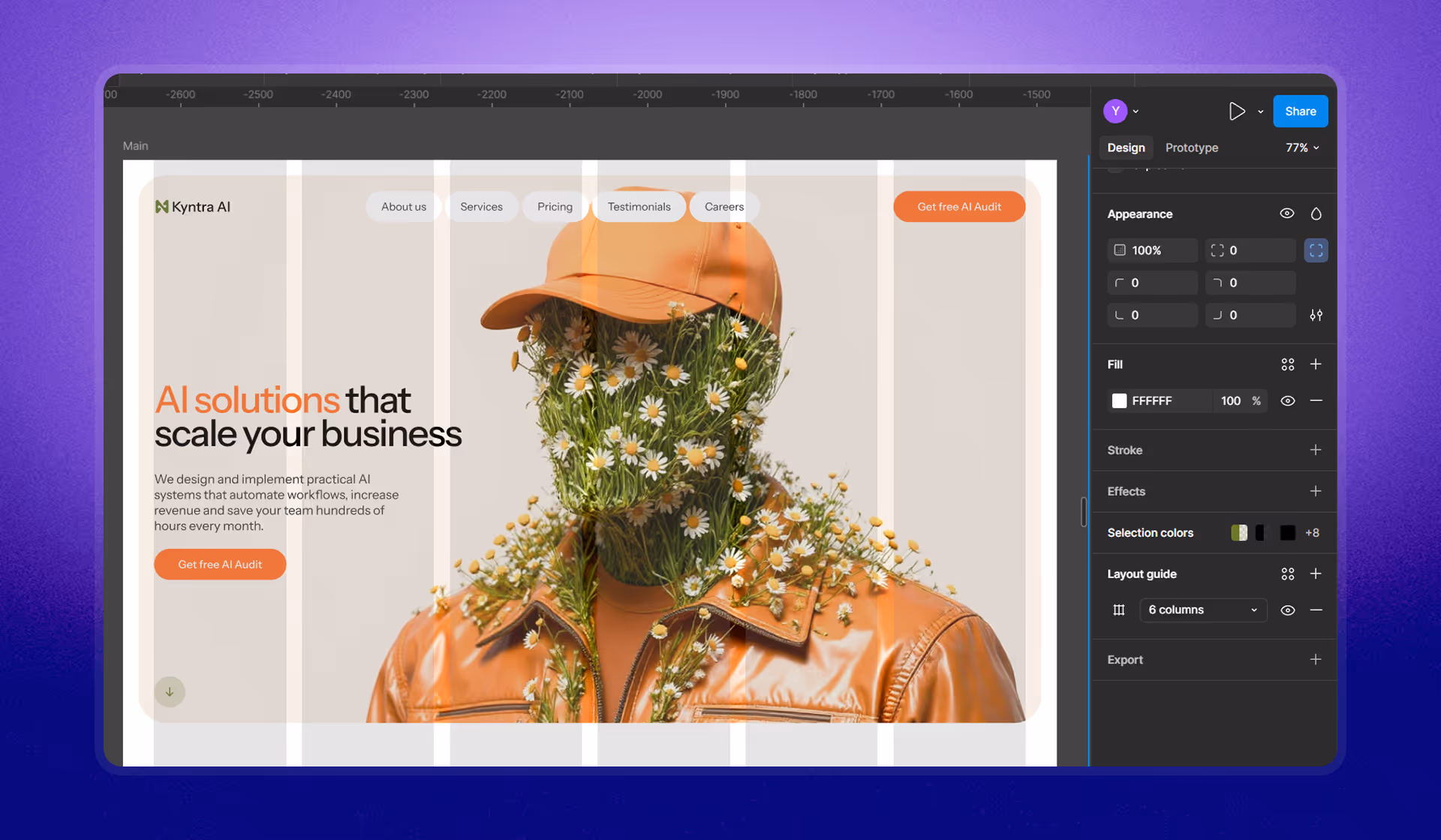
After your desktop is responsive, define device breakpoints and add grids so layout stays aligned as you scale.
Desktop grid setup (example from the script)
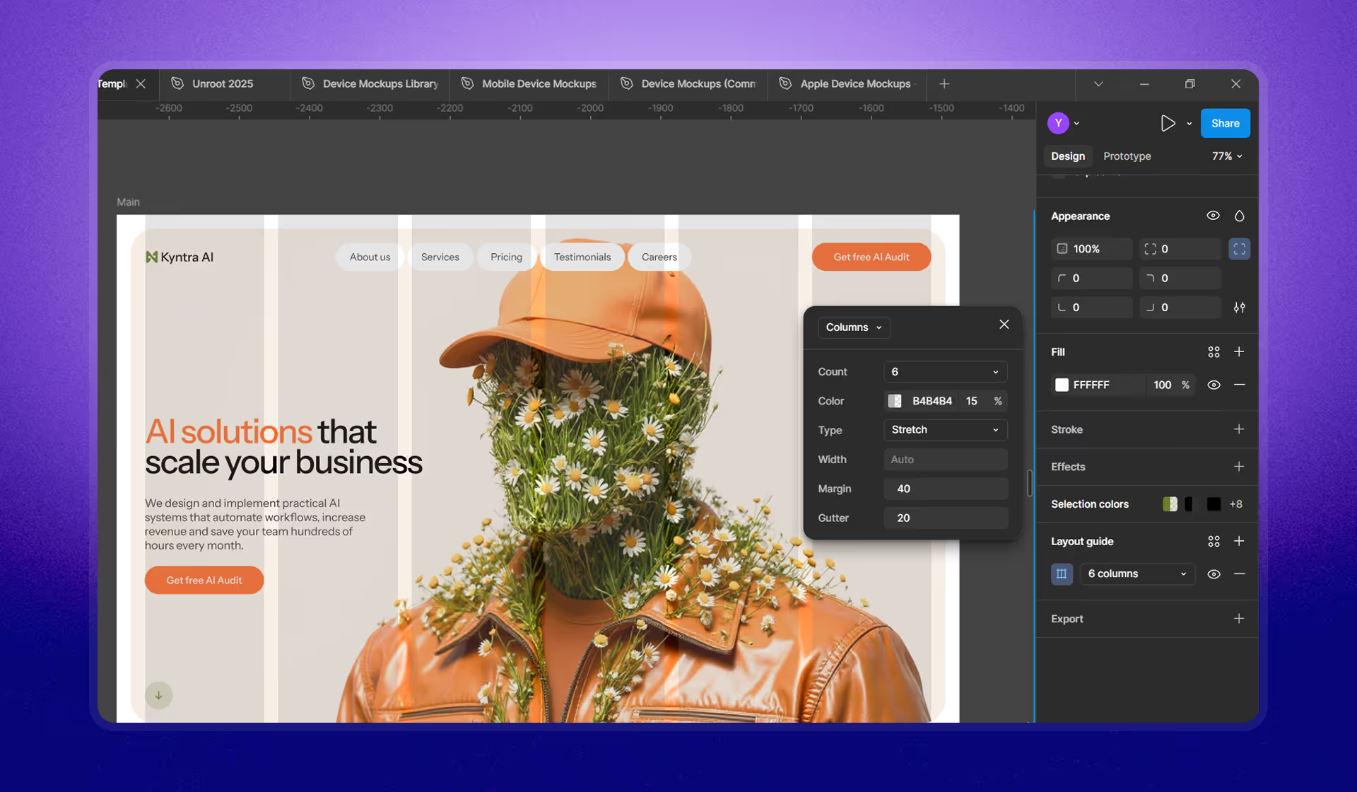
The script example uses:
- Grid type: Columns
- Column count: 6
- Margin: 40
- Gutter: 20
Align content to the grid so resizing stays committed to columns.
If it’s mapped to the grid… things are actually going to stay committed to the columns.
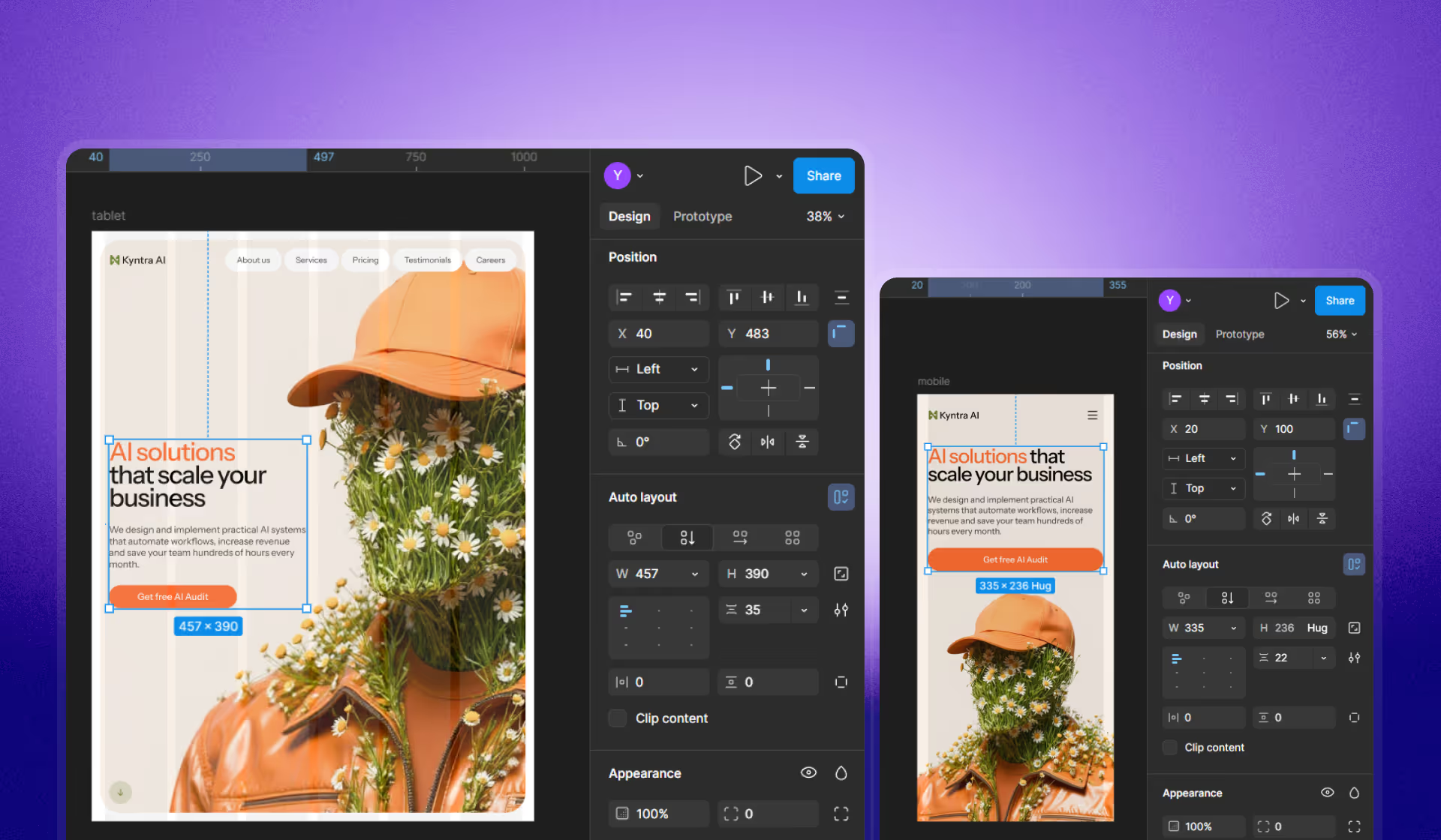
Tablet: duplicate, change grid, realign, then adjust layout stacking
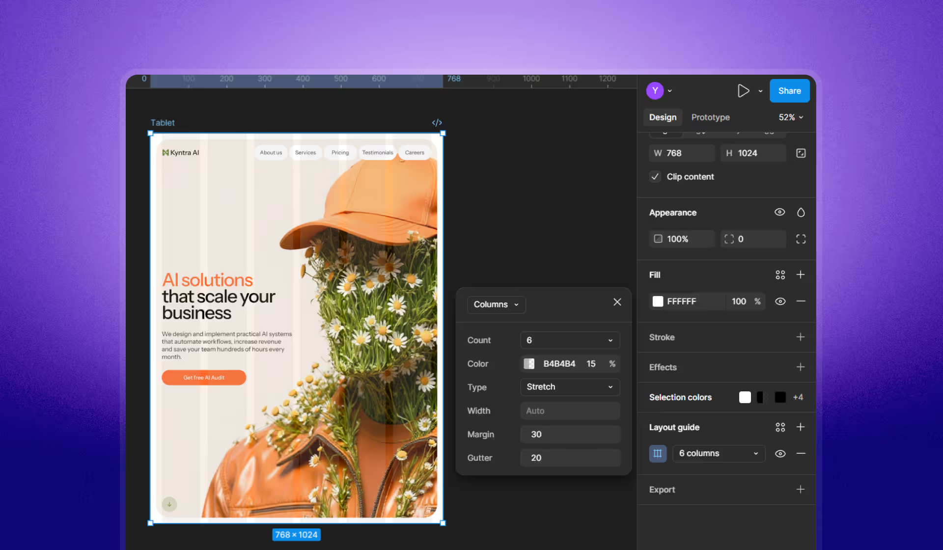
Duplicate the desktop frame for tablet, then update the grid (6 columns, margin 40 → 30, gutter 20). Realign nav and containers to match the new grid.
A key tablet change is often stacking hero content vertically and reordering elements (for example, placing the image above the text).
Change to vertical direction instead of horizontal… switch the order… image to be in the top.
Mobile: duplicate again, reduce grid, then simplify navigation
Duplicate the tablet frame for mobile, then reduce the grid (1 columns, margin 20) and set a 375px reference width. On mobile, simplify navigation by hiding links and replacing them with a compact “Menu” control.

Step 3: Update type sizes and spacing for tablet and mobile

There isn’t a universal multiplier for type and spacing. Adjust based on your layout, while keeping changes consistent across elements that share sizes.
We don’t really have the right answer… you have to feel what is correct for your layout.
The script approach:
- Keep consistent scaling across elements that share the same size (logo type, menu, body text, button text).
- Adjust headings and spacing per breakpoint.
Examples of heading changes: 48 px on desktop, 48 px → 44 px on tablet, 44 px → 38 px on mobile.
Why this translates cleanly into Webflow and Framer
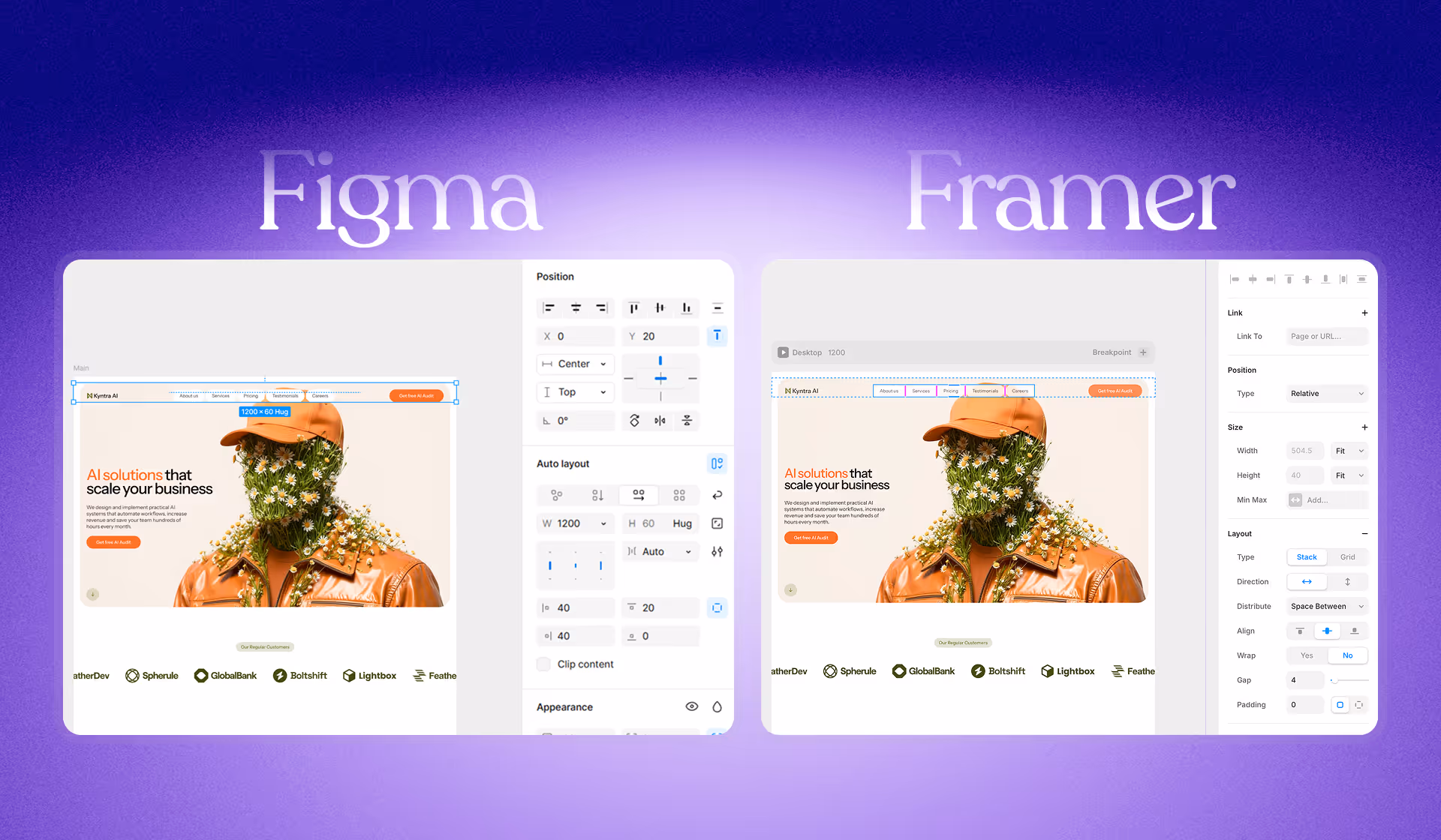
Layout principles carry over. When your Figma file is built with Auto Layout, constraints, fill behavior, and grid alignment, you’ve already done the heavy lifting for no-code tools.
The script also mentions a fast transfer workflow into Framer using Figma-to-HTML plugins: copy from Figma canvas, paste into Framer canvas, then adjust quickly.
Copy it from your canvas in Figma… paste it inside… adjust… replicated… in like 10 minutes or less.
Quick recap: the responsive workflow in one checklist
- Treat breakpoints as ranges (mobile/tablet/desktop), not a single pixel.
- Convert the desktop layout to Auto Layout and group into logical containers.
- Set spacing behaviors (e.g., Space between) where appropriate.
- Fix resizing: change Fixed/Hug elements to Fill container when needed.
- Apply constraints (Left & Right) so containers hold edges during resizing.
- Add grids per breakpoint (desktop/tablet/mobile), then realign content to columns.
- Change stacking on tablet/mobile (horizontal → vertical) and reorder key elements.
- Update typography and spacing per breakpoint based on layout needs.
FAQ
Can you redesign our website and rebuild it in Webflow or Framer without breaking conversions?
Yes. Our process is design-first, then no-code implementation. We rebuild layouts responsively, validate hierarchy and CTA placement per device, and keep performance and SEO basics intact so the new design doesn’t trade aesthetics for results.
What’s the difference between “responsive” and “mobile-first” in a real client project?
Responsive means the layout adapts across devices. Mobile-first is a prioritization strategy: we design critical content and interactions for small screens first, then scale up. Which approach we lead with depends on your audience and what devices drive revenue.
How do you prevent “responsive chaos” when clients want lots of iterations?
We lock layout rules early (containers, grids, spacing, type scale) so changes don’t ripple unpredictably. That means you can iterate on content and visuals without constantly re-fixing tablet and mobile after every tweak.
Do we need a design system before you build the site in Webflow/Framer?
Not always. For many startups, we can start with a lean system: type scale, spacing rules, buttons, forms, and a few reusable sections. If you’re scaling marketing pages fast, we can formalize it into a stronger component system.
How long does a typical “design → responsive build” take for a startup site?
Most marketing sites land in a predictable range once scope is clear: key pages, CMS needs, and animation complexity. The fastest projects are the ones where we agree on breakpoints, layout rules, and content priorities early—then the build becomes execution, not firefighting.
